

After I got some feedback on the Two Row Academic CV, I wanted to make an update.
One column
Some people told me that a one column layout would be better for a CV when you’re allowed as many pages as you want. With just one page, I prefer multiple columns to get as much info across as possible but in this case, readability might be even more important: Hiring committees are constantly stressed and have tired eyes. If we don’t have a page limit, we might as well keep with one column and a bigger font size.
Page counters and footers
I was also told to add a page counter in the style of page 1 of 4, so people will realize when they are missing a page. That’s also why there is the name written redundantly on every page’s footer, so it can’t get mixed up with another applicant.
Safe to print
For more seriousness, I removed all the colour and little icons. I’m a bit sad about it but that also means it’s safe to print with a bad printer without losing any information.
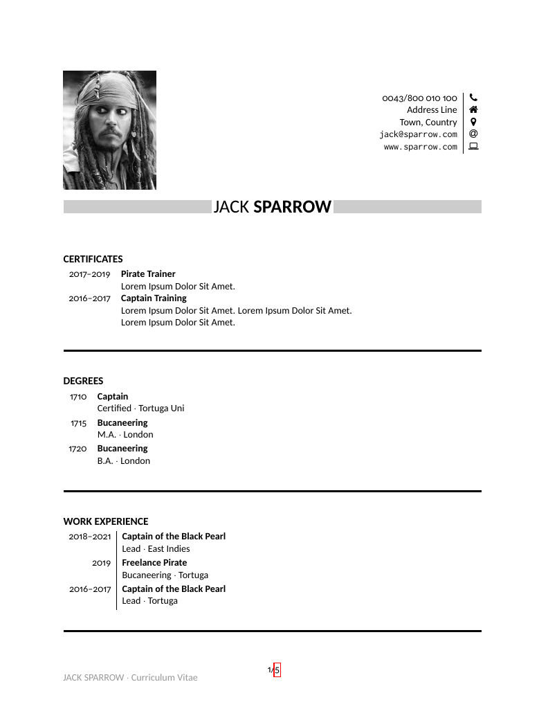
There is still a space for a photo because it’s still customary in some places – but you can you remove it if it’s not appropriate where you want to apply.
Cheers!
Buy me coffee!
If my content has helped you, donate 3€ to buy me coffee. Thanks a lot, I appreciate it!
€3.00

It’s really better now.
LikeLiked by 2 people
Thanks a lot for the feedback, glad to hear that!
LikeLiked by 1 person