
The Ninja show coming to you today with a CV template inspired by simple websites with a main infinite scroll body and a little navigation at the side. Only that here, the navigation is the contact info.
A new template
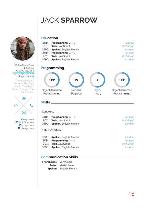
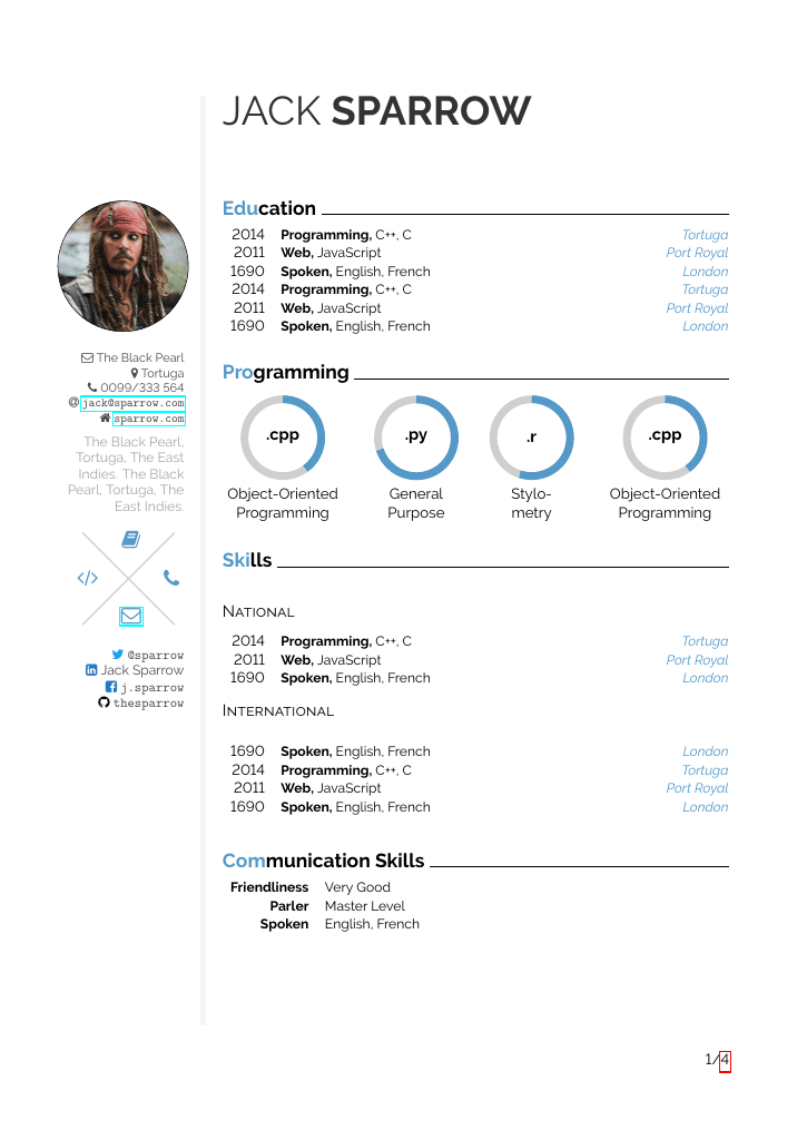
The Monocol Navbar CV is a CV template inspired by simple websites with a main infinite scroll body and a little navigation at the side. Only that here, the navigation is the contact info. The image can easily be taken away if not wanted or needed (but it’s still customary in German speaking areas). Apart from being inspired by simple website navbars, inspiration credit also goes to Jan Kuester’s Left Sidebar CV with the paracol separation rule.
One column, bigger font and page numbering
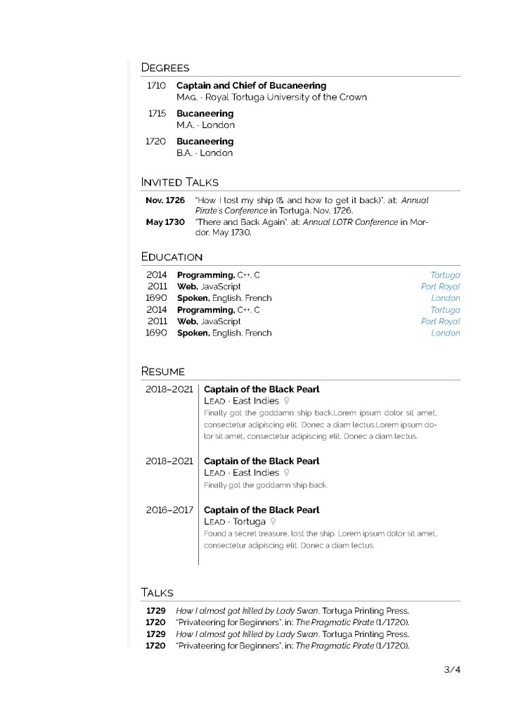
I was told some more classical applications in Academia prefer one column and a slightly bigger font which is easier on the eyes of tired hiring committess (especially in German speaking areas where you seldom have page limits for CVs and thus can easily use a bigger font size). So I thought what I could make of it and this is it. And I was advised to include a page 1 of 4 style page numbering somewhere so that if hiring committees print it out, they instantly know if they have lost a page. So the whole thing has a relatively academic base idea.
Adding infographics to make it fancy
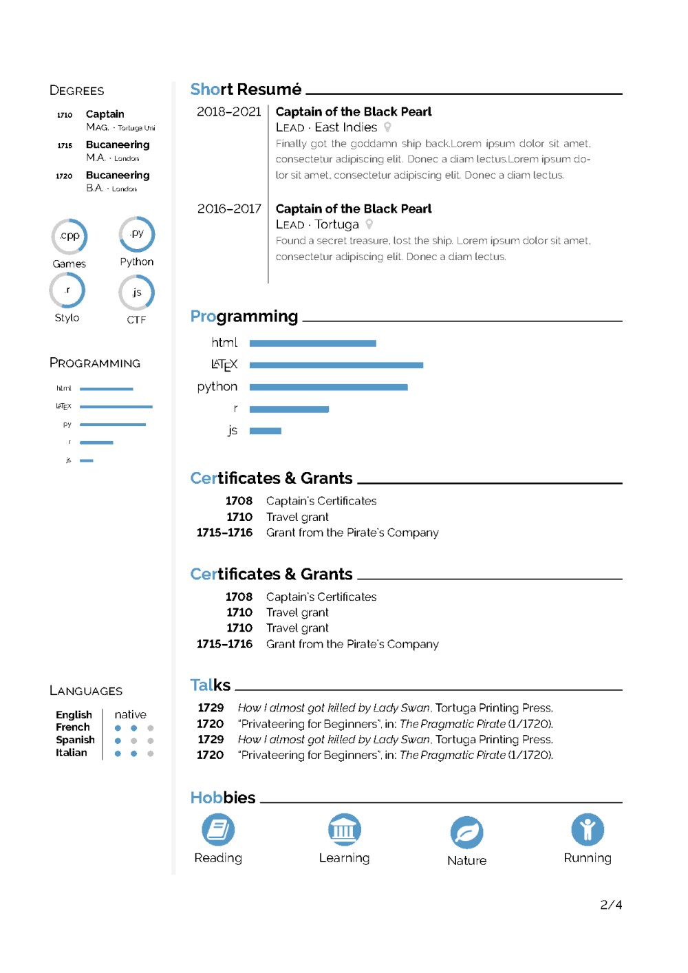
However, if you are in the industry or still insist on making your CV memorable and more visual with infographics, the usual ones from my other CVs (especially Pastel CV but also Timeline CV | Simple Hipster CV | Hipster CV) are still included and should work. That’s what I put on the first few pages of the preview. Since the same commands are used (or mostly the same), it should be easy for you to migrate your CV between my different templates, if you want to try something new.
Usage tips
You can add content to the navbar below the already existing infos by using \switchcolumn or \switchcolumn* somewhere in the document to align cols at the current place.
If you want to make the font size even bigger, search and replace \small by nothing.
You can use all sorts of infographics and fancy elements as shown on pages 1 and following (such as \fancysection{cvcolour}{Deg}{rees}) or you can get rid of all of them (replace by normal sections) for a very academic look as shown on the later pages.
If you remove all the fancy stuff, I guess it will be quite suitable for an academic CV.
Have fun with it.
Cheers!
Buy me coffee!
If my content has helped you, donate 3€ to buy me coffee. Thanks a lot, I appreciate it!
€3.00

Noobquestion: How do i let the navbar start at the same height as the header?
LikeLiked by 2 people
Hi Petr, thanks for your interest in the template – the change you want is actually quite easy, I only tried to hide lots of background stuff with the environments like `makeheader` and `navbar` which really don’t do much but hide what’s going on from the user. What you need to do is replace
`
\begin{makeheader}
\headername{JACK}{SPARROW}
\end{makeheader}
`
with `\switchcolumn` and then insert the makeheader-snippet below `\end{navbar}` instead of the `\switchcolumn` which is there is in the template as it is. So basically, you switch the makeheader-snippet with the `\switchcolumn` after `\end{navbar}` and the `\switchcolumn` from below goes where the makeheader-thing was before.
However, if you do that, you might want to think about using a non-round image. I’m not a design specialist but I have a hunch a rectangular image might look better.
I hope this explanation made sense? If not, please ask!
Good luck with your job applications 😉
LikeLiked by 1 person