
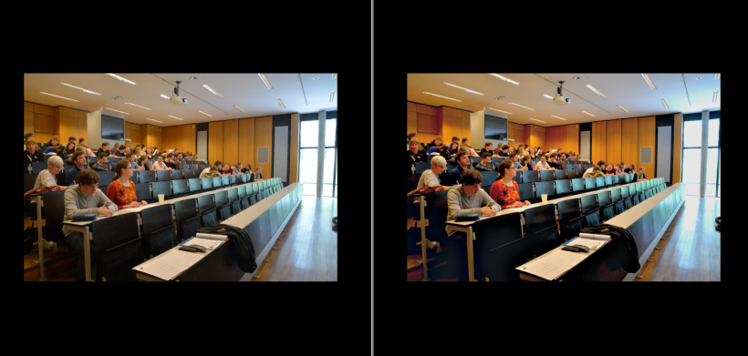
Do people think that you, as a DH person, are also responsible for your project’s outreach activities yet nobody considers you have no freaking idea how to obtain ok-looking event photos for your website? Did you take bad photos but only realized after the event was over so you couldn’t re-take them and are now hoping some image manipulation magic can save you? But also, you’ve never image-manipulated anything ever and don’t (want to) afford professional software which is easy to use? This is the post for you. I will explain some of my amateurish tricks on how to leverage GIMP to beautify event photos.
(Also, nowadays you can install GIMP plugins – like G’MIC Qt – which offers photo editing a lot like Adobe LightRoom but I personally couldn’t get the install figured out on Linux Mint. But it’s supposed to be really good and might spare you the unprofessional tampering with photos which will be explained below).
The content of this post was a part of my old post Two basic image manipulation life-savers. I found that the title wasn’t exactly search engine optimized so people might not be able to find it. Really, one part of this post was about making a vector graphic, for example for creating a project logo, using some vectorizer apps and GIMP. It’s easy and requires hardly any previous knowledge, though having used GIMP before will probably help. The rest is just the old post from here on:
Beautifying event photographs
Use the GIMP Retinex filter
From my research into the retinex filter you should only change the bottom-most setting to adapt the filter. The stronger you make it, the less natural the result, the more noise will be created, the more colours will be enhanced.
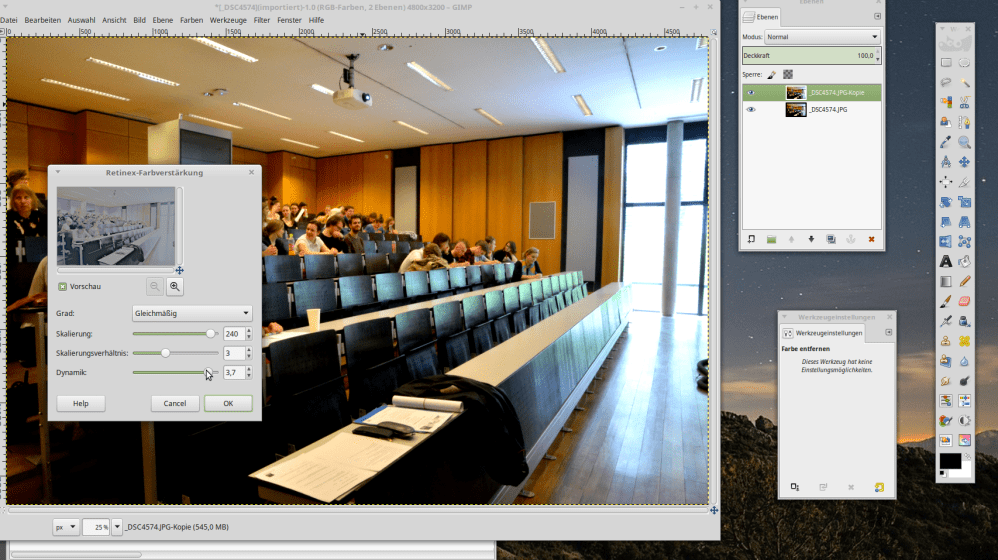
Usually, the point will come quickly where you crank up the colours and sharpness too much so the result looks weird and gets a “steely” feel (try it out to see what I mean). Also, if your images are very big, this will take a moment.
Retinex overlay strategy
For more or less failsafe use of this if you want to achieve results that still look more or less natural:
- use the filter,
- then copy the product (CTRL+C).
- CTRL+Z to undo the effect in the base image.
- Then paste (CTRL+V) the version with the filter on top of the now reverted to its initial state image.
- Open the layer editor, click right: make the pasted section as a new layer. Then scale down the manipulated layer’s transparency to 50% (or as you like).
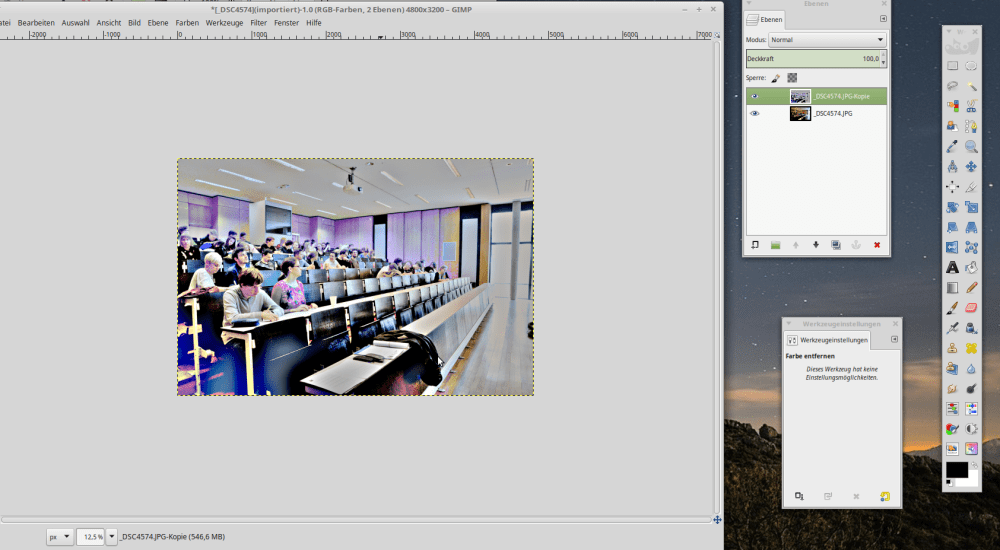
More tips
- Using the strategy explained above, the original picture will be improved without looking all unnatural. And you won’t have to take a lot of time looking for the perfect retinex setting. Just take one that looks ok. With the overlay, details will get lost anyway.
- And by the way, retinex will always create noise. The default settings reduce this to a minimum but it’s still pretty noticeable. So maybe use a relatively fine-grained Gaussian blur afterwards to make up for the noise created by retinex.
- And maybe combine the effect with the “three layer trick” explained below. Play around with it. Find something that works for you. I’m no expert either but I found these tricks quite useful.
- However, often I found that combining both tricks either takes too long or doesn’t create much added benefit. I feel that retinex helps to add sharpness while the three layer tricks improves colours. If colours are already prominent in your picture but shitty, think about reducing saturation after these effects. Also, in some circumstances, the image is too bad to really make up for it, then these effects will only improve the overall thing very little.
- In Adobe LightRoom, you can also choose to use certain settings only on a selected area – so you could crank up the sharpness on just the eyes or just the outlines of something. This will create the illusion of a much better image while still looking kind of natural – without the noticability you would get had you used it on the whole image.
- You can even use a slight blur overall (softening the image, a bit like a retouch) but increase sharpness on outlines and eyes. This will give you a quick retouch – but to do it efficiently, you need to (at least temporarily) get a LightRoom subscription. Also make sure that you don’t have very much different colour levels between the overall settings and the selected patches. (I like a bit more blue-ish, icier setting around the eyes and face most of the time.)
The three layer trick to bring out colours and contrast
- Copy your initial picture into three layers.
- Desaturate the first to grayscale
- and invert it.
- Then do a light Gaussian blur on it,
- set its transparency to 30-35%
- and ‘merge down’.
- Then (you’re ‘on’ what previously was the middle layer now) set this layer’s mode from ‘Normal’ to ‘grain merge’ (‘Faser mischen’ in German),
- then merge down.
This will bring out colours and contrasts better. However, if the colours are not nice to begin with, they will just be intensified as if you’d cranked up the saturation too much.
If this is no good, mabye try the retinex filter to bring out the colours and sharpen instead. I found this three layer trick on the internet somewhere in the past and sadly, can’t find it anymore. If you accidentally happen to know the source, feel free to point it out to me 😉
Other things you could do to enhance your images would be to tamper with the white balance or colour curves. But I decided not to add other stuff here to keep it simple and actionable.

Very basic ‘mini’ retouch for dummies
- Select the eyes and increse colour and contrast. Maybe sharpen too. Don’t select the wrinkles and lines around the eyes, obviously. 😉
- Select the skin regions where there are no lines (like the nose, elbow pit on the arm, etc.) and blur them – either manually or with the blur ‘pencil’. Very slightly!
- To improve skin details, zoom in and pick up the skin colour around imperfections. With a blurry pencil, replace the unwanted skin detail with the other skin colour. Be careful, this can easily become noticable. Do this very slightly.
This will smoothen out impefections. Don’t overdo it though or it will be very noticeable. Don’t smoothe over lines or the result will look comical at best.
The best image manipulation trick is taking better pictures in the first place
But, the most important thing is: Try to get hold of a good camera and take pictures in good light. I personally find it easy to take good pictures when the light is good but when you would need flash, human beings always look bad. At least if you don’t have a clue what you’re doing. In my opinion, you need to be really good at photography to make people look good with artificial light, especially when they’re not prepared for it (i.e. wearing tons of powder to avoid shine, etc.)
So I try to avoid situations where flash is necessary when taking pictures of people. Maybe other people are better at this. But if people are not wearning tons of foundation and powder to mattify their skin, flash is not advisable and you might get better people pictures without it.
Also, ever wondered why models spend so much time on makeup before photoshoots?That’s because image manipulation can only do so much. The better the pictures you start out with, the better the result.
Conclusion
So, these were some simple tips. I’m not really good at this myself but I’ve been doing it for a few years. These little tips have helped me in situations where, for example, I was asked to beautify some snapshots of the last conference.
My experience is that your suffering will be minimized when you have good light and can bring a good camera. This is the most important part.
“Repairing” pictures taken under bad circumstances and making them look good is a really hard task and not worth the time really. But making mediocre shots a little better is something you can learn.
But then again, if you only need small pictures for social media, phone apps offer filters to improve your pictures with a few clicks. So maybe it’s not even relevant for you to “go traditional” and use GIMP at all.
Now edit away (and maybe also check out my review of the Adobe Create Cloud if you’re interested),
best,
the Ninja
Buy me coffee!
If my content has helped you, donate 3€ to buy me coffee. Thanks a lot, I appreciate it!
€3.00
