
In this post, I wanted to share a few tricks for simple image manipulation (with the goal of making pictures look better) I’ve picked up over the years. While tip one will always be to learn to take better pictures, maybe these little tricks will help you when you are asked to put the latest conference pictures online and realize they’re not good and really need a makeover first. So one thing will be to beautify event photos. Another tip I share is how to easily create a nice little vector graphic from a photo of some historical object or person.
First things first
This might seem obvious, but make sure you only use images you actually have the right to use. Check explicitly, don’t just assume! Get written permisson, if it’s not 100% clear what your rights are. If you are supposed to take pictures for an event, most people now mention that pictures will be taken in the event invitation already and that by attending, you agree to have your picture taken. Check what practices are at your institution.
Secondly, I am not a graphic designer or anything and fully self-taught in this realm. These tips work well for me and might work for you too. But just to make sure: I’m not actually competent to teach anyone on this topic 😉
Vector graphic from photo
I want to give you a few tips on how to create a nice vector graphic from a historical photo. Vector graphics make for nice logos, for example. Adding one can be all the spicing up a simple template or poster needs. It’s an eye catcher. They take a while to make if you want a good one (a few hours), but can be done on a train ride or during a meeting 😉 and I’ve never regretted making one and people loved them. Even though I’m not a professional logo / graphic designer and my results are far from perfect.
How to go about it
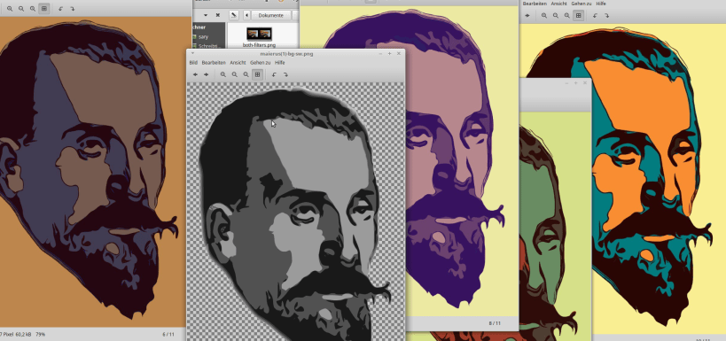
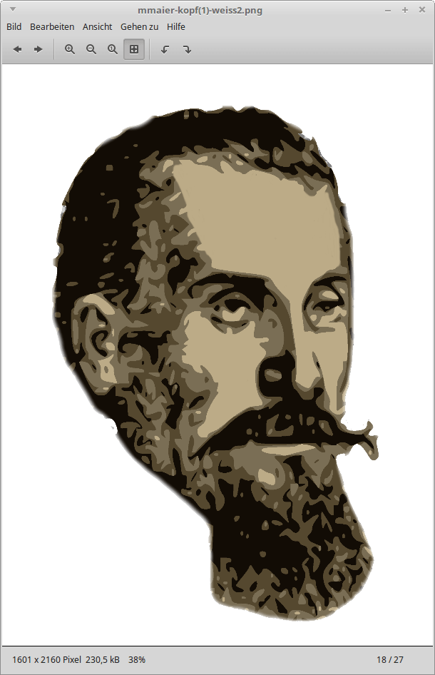
Scan very high quality if the image is from a book. Or take a high quality photo, reducing background elements if possible (will save lots of time later). Get rid of noise (Gaussian blur, 10px or something, try it). Then vectorize it, for example using Vectorizer.io: they will let you do quite enough if you sign up for a free account and disable your adblock. You can’t do very many images at the same time but since you’ll have other image manipulation taks to do in between, this will be just fine. Of if you’re pressed, use a trial account. Or do Vectorization.org. I also like the Imaengine app. But you can only save the results when you pay a few bucks for the full version (worth it though). In this case, save it high quality. But maybe also get back to Imaengine only after you’ve cleaned out background elements you don’t need to add final touches. Play around with reducing the number of colour or adding some blur. But reducing the number of colours basically is the main thing you want to do. Maybe start with the smallest possible number of colours and go back up until you think you got the “feel” of the original image back, but without the details. (For example, with just two colours, you’re likely to have lost the original “feel”.)
Then the work starts: Manually get rid of patchy sections as well as all the background in GIMP. It will look a lot better and way more professional if you just take the time to do this (even if it’s not perfectly done). This is where you can invest the 1-2 hours I mentioned this would take. As I said, I am by no means an expert but I feel that most image manipulation things just take a lot of time and effort – they aren’t necessarily difficult to do. So even a beginner can achieve an ok result if they’re just willing to put in the time.
Edit: For getting rid of the background, you could also use services like Remove.bg to speed things up, as was pointed out thankfully by the #TeXLaTeX community on Twitter. It works super well with many types of photos. However, with my early modern print thingy, it didn’t know what the foreground was supposed to be: “Please select an image with a somewhat clear distinction between foreground and background. For instance, try a photo of a person, product, animal, car or another object.”
Manually drawing on the computer in an image manipulation program is not everybody’s thing an might take some getting used to. Many people will want to use a mouse for this. Don’t get discouraged by initial failures. It still is a question of practice and routine. You will, however, be able to get instantly better and more failsafe results if your base image is fairly big and you zoom in very closely. Start with baby steps. It will get easier once the most patchy areas are gone. Once you’re done, run it through the vectorizer once again to get rid of some of the small patchiness you might have overlooked or created while manually drawing around.
Delete the background. This can be done in multiple ways. If it’s all done in the same color, there is the option ‘color to transparency’ (or something like that). Else you might want to use the wand too and click delete or the like. Save (=export) the result. Voilà, your vector graphic is done.

Some more tips
- To take into account: If the logo is supposed to be displayed very small, be sure to reduce a lot of detail. Always opt for 30% less detail than you think you need.
- Maybe make multiple logos or draw stuff on paper. Multiple quick sketches always yield better results than trying to get it perfect the first time. Fail fast and learn from your failures.
- Another win when using vectors is that you can output them as SVG or enlarge their size without things getting pixely. This might also be a reason you want to create a vector graphic in the first place.
Summary of a few GIMP shortcuts (learn some to significantly speed things up)
- O = get the color (click)
- P = switch to pencil
- CTRL + C: copy
- CTRL + V: past
- CTRL + SHIFT + V: paste as new image
- CTRL + SHIFT + E: export as (this is the ‘saving option’ in GIMP which will save the actual product, not the project itself – ‘save’ will save the project).
- CTRL+Z to undo
- paste (CTRL+V)
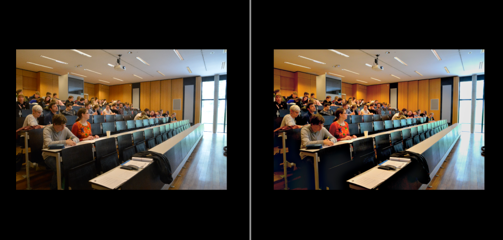
Beautifying event photographs
Use the GIMP Retinex filter
From my research into the retinex filter you should only change the bottom-most setting to adapt the filter. The stronger you make it, the less natural the result, the more noise will be created, the more colours will be enhanced.
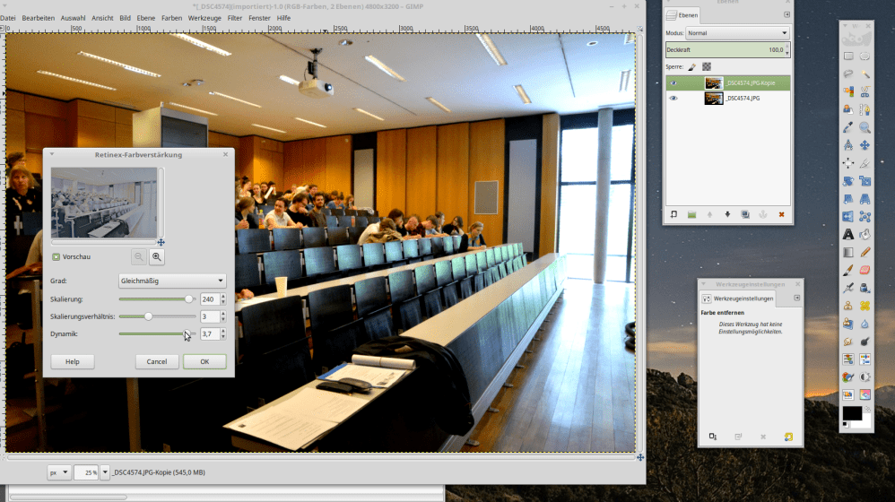
Usually, the point will come quickly where you crank up the colours and sharpness too much so the result looks weird and gets a “steely” feel (try it out to see what I mean).
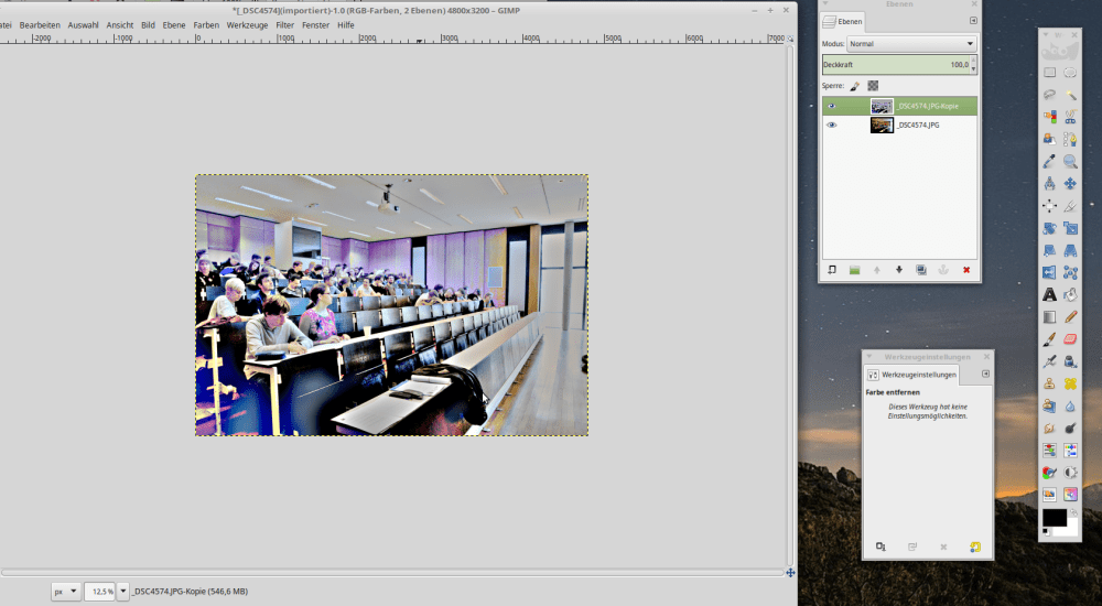
For more or less failsafe use of this if you want to achieve results that still look more or less natural: use the filter, then copy the product (CTRL+C). CTRL+Z to undo the effect in the base image. Then paste (CTRL+V) the version with the filter on top of the now reverted to its initial state image. Open the layer editor, click right: make the pasted section as a new layer. Then scale down the manipulated layer’s transparency to 50% (or as you like). The original picture will be improved without looking all unnatural. And you won’t have to take a lot of time looking for the perfect retinex setting. Just take one that looks ok. With the overlay, details will get lost anyway. And by the way, retinex will always create noise. The default settings reduce this to a minimum but it’s still pretty noticeable. So maybe use a relatively fine-grained Gaussian blur afterwards to make up for it again.
And maybe combine the effect with the “three layer trick” explained below. Play around with it. Find something that works for you. I’m no expert either but I found these tricks quite useful.
The three layer trick to bring out colours and contrast
Copy your initial picture into three layers. Desaturate the first to grayscale and invert it. Then do a light Gaussian blur on it, set its transparency to 30-35% and ‘merge down’. Then (you’re ‘on’ the middle layer now) set this layer’s mode from ‘Normal’ to ‘grain merge’ (‘Faser mischen’ in German), then merge down. This will bring out colours and contrasts better. However, if the colours are not nice to begin with, they will just be intensified as if you’d cranked up the saturation too much.
If this is no good, mabye try the retinex filter to bring out the colours and sharpen instead. I found this three layer trick on the internet somewhere in the past and sadly, can’t find it anymore. If you accidentally happen to know the source, feel free to point it out to me 😉
Other things you could do to enhance your images would be to tamper with the white balance or colour curves. But I decided not to add other stuff here to keep it simple and actionable.
Very basic ‘mini’ retouch for dummies
Select the eyes and increse colour and contrast. Select the skin regions where there are no lines (like the nose, elbow pit on the arm, etc.) and blur them – either manually or with the blur ‘pencil’. This will smoothen out impefections. Don’t overdo it though or it will be very noticeable. Don’t smooth over lines or the result will look comical at best.
The best image manipulation is taking better pictures in the first place
But, the most important thing is: Try to get hold of a good camera and take pictures in good light. I personally find it easy to take good pictures when the light is good but when you would need flash, human beings always look bad. At least if you don’t have a clue what you’re doing. So I try to avoid situations where flash is necessary when taking pictures of people. Maybe other people are better at this. But if people are not wearning tons of foundation and powder to mattify their skin, flash is not advisable and you might get better people pictures without it.
Also, ever wondered why models spend so much time on makeup before photoshoots?That’s because image manipulation can only do so much. The better the pictures you start out with, the better the result.
Conclusion
So, these were some simple tips. I’m not really good at this myself but I’ve been doing it for a few years. These little tips have helped me in situations where, for example, I was asked to beautify some snapshots of the last conference. My experience is that your suffering will be minimized when you have good light and can bring a good camera. This is the most important part. “Repairing” pictures taken under bad circumstances and making them look good is a really hard task. But making mediocre shots a little better is something you can learn. But then again, if you only need small pictures for social media, phone apps offer filters to improve your pictures with a few clicks. So maybe it’s not even relevant for you to “go traditional” and use GIMP at all.
Hope this helps someone,
best,
the Ninja
Buy me coffee!
If my content has helped you, donate 3€ to buy me coffee. Thanks a lot, I appreciate it!
€3.00

4 thoughts on “Two basic image manipulation life-savers”